All Activity
- Past hour
-
Thanks!
- Today
-
I see what you mean. It looks like the shading is inverse. Hard to see, but it's possible the ab/muscle definition lines (under the grey web details) are the right color of blue, but the way the actual character is shaded is opposite, meaning the dark blue is prominent and shaded with black, rather than the other way around.
-
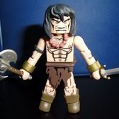
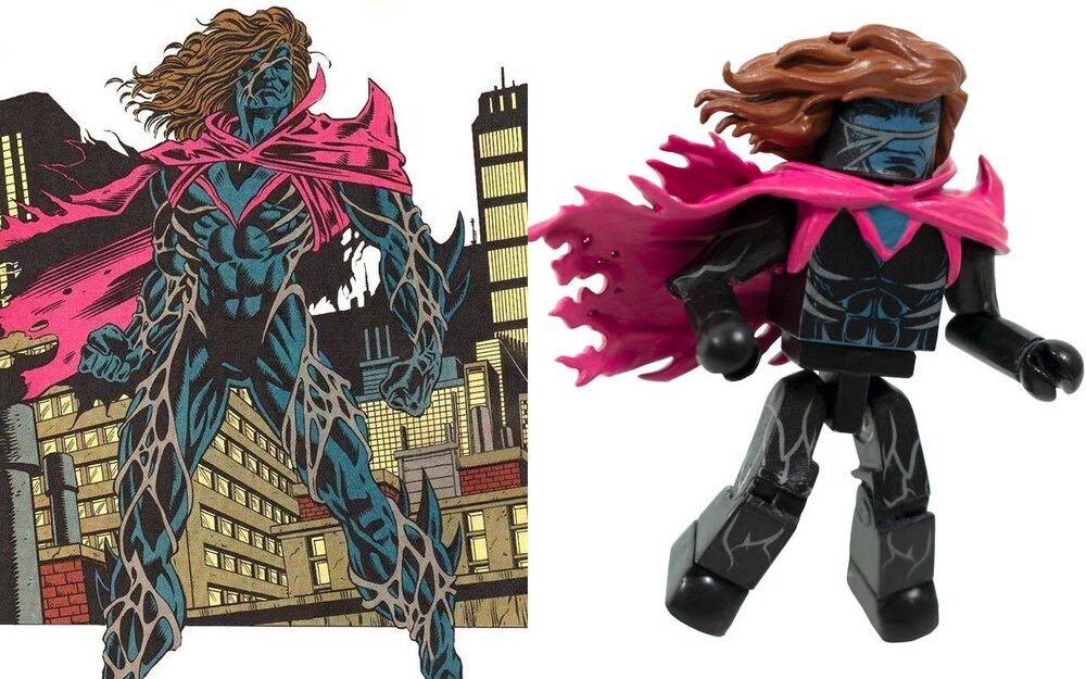
He's wearing a costume, the patterning on his costume is based on the scars on his skin:
-
As i mentioned multiple things about Kaine, to clarify what i consider the actual "problem"
-
(decent series, btw)
-

New Licenses, What would YOU like to see Minimated ?
Trekker 42 replied to bruticus's topic in Minimates of Licenses Future
I’d dump Saw for Krennec. He was in other things. We could still get him. -
New Licenses, What would YOU like to see Minimated ?
WookieFodder replied to bruticus's topic in Minimates of Licenses Future
Andor the Disney Plus Show. but really… 7 Piece Boxset Rogue One: Star Wars Story Jyn Erso, Cassian Andor, K-2S0, Chirrut Imwe, Baze Malbus, Bodhi Rook the Pilot, and Saw Gerrera. personally I would sub out the Pilot for the Villain Ben Mendelson’s character Krennic. -
This weeks episode was another bloody winner, IMHO. Spoilers for those who aren't up to date
- Yesterday
-
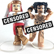
These are gorgeous minimates! But! I kinda would like to see the new spiked forearms from Spider-Man 2099 used on Kaine. Not a deal breaker, though.
-
.....& now that the Minimate Goblin is intensely scrutinised for accuracy , I'm now looking at his non-clawed hands . It's still a beautiful looking 'mate.
-
Wow, that's awesome! I BARELY watched the show, but I always liked the ship.
-
I think they look great as well. I don't really know these characters but I'm really excited for these, not just because of the cool designs but because of the evolution of the brand/designs by making more dynamic figures and accessories (and the purple on the interior cape is not really visible in these pictures or in the display picture, sorry)
-
I personally think they look great. Looking at the reference, they seem on-model. Our Kaine has veins on his arms, legs and chest. Our Goblin has purple on the inside of his cape, not sure everyone can see that. If the outside is not SUPPOSED to be black, per interior artwork (I have just requested the GN), then it may very well be our mistake, but looking at the light source in the picture, I tend to trust Scott McDaniel in all things.

-
A I find the caption at the foot of the 'recolor' ironic ..." a lighter shade of green " . It would be impossible for me to be sure but from a printer's technical perspective the Key (black) is now 'blacker ' & the Magenta has been decreased. The result would be that all the red /purple shades would be different & all the dark areas would be darker . I accept that I might be wrong but it is simply far more reasonable for me to believe that I am right . So there you have it .....blame the printer ,everybody else does
-
not to belittle the subject as I have no idea who Kaine is, but, does this mean he's basically naked with a pink cape? If not, why would the deterioration of his skin be visible outside of his costume? Are they thick welts? Is his costume deteriorating too? Am I missing something? Sorry, just very curious.
-

cylonchaney's vehicle customs
cylonchaney replied to cylonchaney's topic in Custom Creations & Artwork!
I've been on a bit of a break from vehicle design. Too busy with work and life etc. Last night the urge struck me to do a little CAD work. I thought this show had just finally hit its stride in the last season. It's a shame it got cancelled just as it was finally getting good. But I always loved the ship design. The latest ship I feel compelled to design is what I lovingly call the Archerprise. I've been thinking all of these captains with no crew should at least have a ship. I think I'm going to do a Voyager and Enterprise D, maybe a Defiant for Sisko, and maybe a cube for the Borg Queen. Will definitely do a TOS shuttle. Not sure if a tiny single seater (likely) or a bigger one to hold the "Galileo 7". Will plug away slowly at the Aliens dropship when the mood strikes. It looks so close but there is so much work to do on it still. -
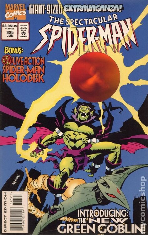
For posterity here is the recolor of Green Goblin against the original cover. Not trying to split hairs, but other than adding depth of color I don't see any revision being made to the actual tones of his outfit. The cloak still looks black to me, in the same way that Kaine does. That said, I would hope for some purple on the underside as that seems to be a constant.
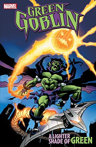
- Last week
-
@DSTZach Okay, I'm trying not to be confrontational but i am confrontational by nature (i have an Emma Frost avatar for a reason) and i apologise for if anything like "lazy" or anything else that sounds insulting is in here but i want to raise these points Kaine's Minimate design is based on Mark Bagley art from Amazing Spider-Man #397. This is actually an inaccurate depiction of his costume - namely the colours and the lack of design elements (or the visibility of them in the art). Kaine was created and designed by Steven Butler in Web of Spider-Man #117, he is otherwise consistently depicted as his mask being the same colour as the rest of his "costume" (be it a blue or black, however one interprets it, neither interpretation would be wrong or incorrect). Whereas most of his design elements are actual crucial parts of the character's history and origin. He is scarred (due to cellular degeneration caused by imperfect cloning). The lines, resembling random web lines, all over his costume are representative of that. He has spikes, also caused by his origin as a faulty clone. Green Goblin's design is based on a recoloured cover to Spectacular Spider-Man #225 for the Green Goblin: A Lighter Shade of Green trade paperback from the early 2010s. These new colours are, again, a bad representation of the character's colour scheme - the trade paperback cover is the only image of the character with that almost blue shade of purple. Likewise, the use of shadows has been misinterpreted as part of the colour scheme. Like Kaine, certain things are again important parts of the character's backstory. Phil Urich's origin is that he stumbled onto a secret hideout formerly used by the Green Goblin (we never learn if it was Norman or Harry, just one of them) and all of his equipment and even his costume are leftover Green Goblin gear. The colours are meant to be whatever colour an Osborn Green Goblin costume would be in 1995. In my mind, I'm willing to accept many little things. As I noted, Kaine... should... have spikes all over but that would be a nightmare to actually implement. Getting rid of that - that is fine with me. I understand that completely. I never for a minute even expected him to have spikes if we ever got him. Then his patterning that runs throughout his body is probably a bit too detailed, randomly complicated and annoying to actually put on his arms and legs. Nor is it that I am a stickler for "what I remember", I'm actually a big fan of the Marvel Legends figure of Madelyne Pryor from X-Men 97 and prefer that to her actual comic costume. Yes, I recently said I felt compelled to make Typhoid Mary look more like how she looked in the 80s but I was totally fine that I had to do that, I was happy there was a Typhoid Mary to do it with at all. I don't know what to say. Initially I was worried because things that are quite core to the characters were not known - and that's forgivable. I'm not expecting people making kid's toys to know every facet of every character from a license. I also know that licensors often don't really provide reference materials and that actually devoting resources to the level of research that people believe they deserve isn't viable either. If you don't know Kaine's costume is covered in those weird web style patterns because his skin is like that and it's all a big part of his character... that's fine. And the Phil Urich thing, you don't have to know that. Neither of these things are essential knowledge, my problem is that I feel pretty confident I have identified the exact sources of these designs. I don't mean to come off as snide or insulting when I claim they are the first image results on Google Image Search for those characters but it is the truth. It opens a myriad of further concerns - things like the fact Google displays multiple results at once, so why has reference only been narrowed to the one when even just a quick glance at a second image would quickly make it clear that the colours aren't like that anywhere else. Furthermore, maybe more practically and demonstratably concerning, if this is evident of overall reference - what's to stop the next wave of Minimates having a character design accidentally based on original fan art by mistake? It happened to Mike Deodato Jr. with a cover featuring Kate Bishop Hawkeye a few years ago. The recent DC animated movies "borrowed" (aka outright stole) a DeviantArt redesign of Black Lightning. Something like that one recoloured Green Goblin trade cover could just as easily have been some guy practicing colouring and they posted it on Twitter and it got retweeted a bunch and then someone uploaded it to a forum or a website or posted it in a Favourite Characters Thread and it got passed around over and over again and now it is the first Google Image Result without the clue of it's origin. Now, having said all this and had my 17th moan of the year on here, I think the absolutely funniest response would be to not acknowledge any of this and just clinically say "these are prototype shots for marketing purposes, they are not representative of the final product".
-
Having thought on it, yep, that recoloured image for the trade of the series is exactly what they've based Phil Urich on. My head space was thinking of the purple because I knew he was purple and green so I didn't really even clock or have the mental capacity to recognise that to someone who has never seen the character before, the amount of black could be construed as his cloak is black and it is part of his colour scheme. That it's not even the original colours of the cover (it was a recolored image for a trade paperback in the early 2010s) and that for some reason they are referring to that and only that is genuinely dismaying.
-
New Licenses, What would YOU like to see Minimated ?
cylonchaney replied to bruticus's topic in Minimates of Licenses Future
I'd buy some Fallout mates. -
Bastion? 🤔 really hoping we get him at some point. lol I missed out on when @luke314pi auctioned off the custom ones he made.
-
 Fallout minimates are something I've wanted for ages, but the show gives the property a higher profile and some more obvious character choices. I can imagine a box set of the leads and an Endgame-type set with vault suits and lots of heads, at least.
 -
I totally understand your 'why's' ? TBQH I am not up to speed with this particular SM era but I can see where you are coming from ,having just studied 'Phil Urich Green Goblin' on the Marvel (database) . There's a great picture of PUGG & I wouldn't mind betting that that picture heavily influenced the Minimate designer , who knows? In that picture GG's cloak looks to be black on the outer side & a mixture of purple & red on the inside ! Heaven forbid that I am being perceived as being an authority on....er.... anything
-
Then why is the product's mask and "chest emblem" not the same black of the rest of his costume? I know very well that Kaine's costume could be seen as black, but the Minimate's mask and the bit on his cape piece are blue against the rest of the body which is black. Whatever colour Kaine's costume is, however you want to interpret the colour, it is very definitely the one base colour. The Minimate is presenting two colours. The reason and the reason for the entire Minimate looking off is this one image which is the first that comes up on Google and is the only time he is drawn that way - incorrectly without the scar patterning running all through his costume and wherein he appears to have blue and black parts. We're getting a Minimate of a character based on one art team's mistake in an issue rather than the character's design as it appears in every other issue. And then on the other hand, why is Green Goblin's purple cloak completely black. Not even matching the dark almost blue purple parts of his costume. It's the exact same problem as Kaine, the designs either haven't been researched adequately or they have become lost from what they are meant to look like along the way. I challenge anyone to find me a picture of Phil Urich Green Goblin with a combo of black cloak and almost blue rest of costume. The closest I can find is this which is a digitally recoloured cover for a trade collection and still is far from black and blue. This was the original art and it's colours.
-
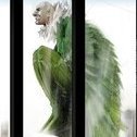
Daaaamn! That's such clever reuse of the Shadow Merk wings.