

Donny B
-
Posts
949 -
Joined
-
Last visited
Content Type
Profiles
Forums
Events
Everything posted by Donny B
-
Minimate pictures you'd rather not see.
Donny B replied to buttheadsmate's topic in Crisis of Infinite Minimates
No guilt here, I had to work for that army! Hours of driving and dealing with K-Mart customer service reps! PK13 helped me with one when they first released, and I snagged 2 from Luke when he offered them up, but the rest were from driving to 20+ K-Marts in multiple states. I almost left a post along the same lines. When I found my second Kraang in store, I was happy until I thought "this is a Kraang that another board member could have..." and so I stopped with 2. But then I remembered my first time army building with Minimates. I hunted down AIM Agents in the same manner - driving from TRU to TRU over several states for I don't even know how many weeks, looking for whatever I could find. Granted, the circumstances were slightly different at the time - the AIM Agents were also released in an LCS wave, making it easy enough for people without a TRU to get their hands on them. And they weren't new to TRU like TMNT was new to KMart, so the distribution and in-store availability was a different animal. Still, I eventually got called out for it on here (I'd go looking for the post, but I'm lazy), and ever since then I've been very cautious with my army building. But regardless, I had the exact feeling you described - I put a lot of effort into building my little army, and it's one of the highlight of my collection. I don't feel guilty for working to acquire those mates, and unless you were ever going to pull a Minimate Menagerie with your Kraang, I don't think you'd have to feel guilty for your collection either... Even if I was one of the ones whose initial thought was "man, and I feel bad having 2!" -
That's fascinating, and I love the amount of detail you pour into these pieces. It's stellar work, for sure
-
That has been an interesting question that I've had to ask myself recently, in response to life trajectories/goals/financial limitations. While I certainly don't have display room for most of my collection, I also don't have any real desire to cut back on what I purchase. Sadly, I do need to be more discerning now than when I began collecting a decade ago, so I've had to make the choice to stop collecting all movie mates. I find that my interest is heavily focused on the comic releases, with quite a few other licenses to boot. But my bottom line for collecting is not to display, but rather to feed my creativity. I love to photograph my mates or draw images based off of them, and so I feel that I need all of the ones relevant to my creative process... Which is just about all of them =P
-
Trying to decide a definitive best and worst of any character is going to be tricky. Personally, I have 5 or 6 mates that are vying for the title of 'best Iron Man' and w25's Classic Iron Man isn't among them. Still, I will not question or argue with canon law Seriously, though - the 'best and worst' series of blog posts is a cool idea, and I look forward to more. I'm loving how Luke's Toy Store is expanding with this blog. It's great additional content!
-
Pathfinder minimates!-First box set revealed
Donny B replied to Kostisfire's topic in Indie Comics Minimates
Yeah, what they said (I seriously couldn't say it better... or more hilariously ) Thanks so much to you and your friend for hooking all of us up! -
General Minimate Pictures Thread
Donny B replied to Punisher's topic in Crisis of Infinite Minimates
Sweet setup! What background is that? -
This is my new favorite thing.
-
TMNT Minimates - it's official!
Donny B replied to youbastards's topic in TV, Movie, & Video Game Minimates
I don't want to hate on the new movie, but it's just so hard not to the rights need to revert back to Marvel where we know it'll be handled properly. Okay, joking aside. As a kid who was obsessed with the original TMNT cartoon and the first 2 movies, and having been underwhelmed with the 2003 cartoon, I am completely in love with the new Nick toon. Even moreso than the original, which will always hold a very very special place in my heart. I'm so happy that we're able to have 'mates from this version. -
Pathfinder minimates!-First box set revealed
Donny B replied to Kostisfire's topic in Indie Comics Minimates
Very generous of you to offer a hookup, Ninja! And thanks for the heads up, Zach! I am drooling over this goblin ... I love all the Pathfinder mates that have been released so far (enough to even check out the games despite never even hearing about them before the mates came out) and this goblin is just all kinds of fun. GitD can be gimmicky if used too much, but I feel like DST hits a good balance with how they utilize that feature. -
General Minimate Pictures Thread
Donny B replied to Punisher's topic in Crisis of Infinite Minimates
Dang, he looks like he's on cloud 9. I'm absolutely loving this thread. There are so many great images popping up on here... -
General Minimate Pictures Thread
Donny B replied to Punisher's topic in Crisis of Infinite Minimates
Wow. Just wow. Very impressive! -
Weird. I double checked every link and there were no problems until I posted. Apparently I'm not doing something right with the photobucket links. It should be fixed now, but here is a separate upload:
-
Minimate pictures you'd rather not see.
Donny B replied to buttheadsmate's topic in Crisis of Infinite Minimates
it's... it's beautiful. Knowing what I do about how you package Minimates for mailing, I can imagine the system you have in place for your personal collection. And my OCD approves -
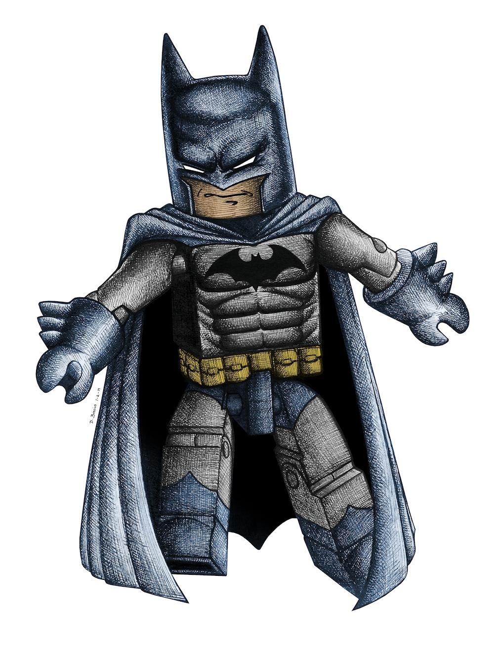
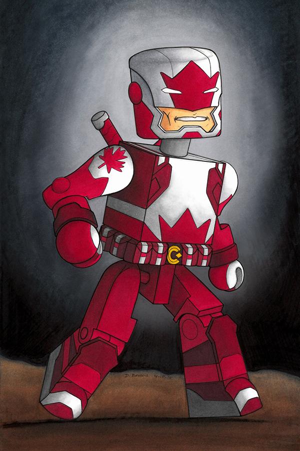
I love drawing. Sadly, the older I get, the harder it becomes to find time to just sit down and create art. Still, within the last few years, I've been slowly building up a body of work specifically focusing on Minimates, and I've decided to finally get them collected together in a thread here on the Multiverse. Click on the thumbnails to view larger scans of each drawing. ---------------------------------------------------------------------------------------- YURIKO ARAN I'll start with my very first Minimate drawing, Yuriko Aran: An amalgamated design that I came up with for the MMMV Alternate Universe Custom Contest. The general idea here was to blend Samus Aran (from the Metroid game series) with Lady Deathstrike (from Marvel Comics). The color scheme is a little bland, but that was on purpose, as I felt that it best represented the design elements of both respective characters. Size: 11" x 14" Medium: Colored Pencils & Micron Pen Finish Date: March 10, 2011 ---------------------------------------------------------------------------------------- CHOR OF THE HYLIDS Next up is Chor of the Hylids; Another original design I came up with, this time for the Create Your Own Battle Beast Contest. I think this design would have blended in decently with the unreleased second wave of Battle Beast Minimates. But regardless, I really enjoyed the conceptualizing process - especially when figuring out how the legs would work. Size: 11" x 14" Medium: Colored Pencils & Micron Pen Finish Date: May 29, 2012 ---------------------------------------------------------------------------------------- VORIN This drawing of Vorin was done before the actual Battle Beast Minimates were even released, so I based it on a photo. This is a slight variation of my entry for the Trick or Treat Contest. I drew this specifically for the contest, but I knew that I wasn't going to want this drawing to have a Halloween theme once the season had passed. So I drew what you see below, scanned it, and then scanned it again with separate drawings for the speech bubble and the candy basket taped in place. Size: 8" x 10" Medium: Micron Pen Finish Date: October 2, 2012 ---------------------------------------------------------------------------------------- SCALPUS / STRICTUS Continuing with my Micron Pen style of Battle Beast drawings, here is Scalpus (or Strictus, if you have the LCS version). This one is special because it's the first Minimate drawing I did just for myself (as opposed to the others, which were all done for contests). I think that there is a noticeable difference in the quality of this drawing, since I had no time constraint and was able to work on it at my leisure. If 'art is never finished, only abandoned', then this one was abandoned after I was content with its progress - not when a deadline told me it was time to stop. Again, I worked on this one before the line was released, so his pose is taken straight from an official promo image. Size: 8" x 10" Medium: Micron Pen Finish Date: November 15, 2012 ---------------------------------------------------------------------------------------- 10 YEARS OF MARVEL MINIMATES Now we're onto my first big Minimate art project. When the 10th anniversary of Marvel Minimates rolled around, I knew I needed to do something special. And so did the Minimate Multiverse. My entry for the contest was one of the more time consuming drawings I've ever done, eating up all of my free time for more than a week straight. My idea was to convey the first decade of Marvel Minimate history in one image, and I felt that contrasting the classic releases of certain characters with their newly bulked up counterparts would make for a great visual representation of how the line has progressed in that time. This entry is comprised of 10 individual pencil studies, which I then scanned and colored via Photoshop. Here are links to each separate drawing, with side-by-side comparisons of the Photoshop coloring: Classic Juggernaut - Bulked up Juggernaut Classic Venom - Bulked up Venom Classic Hulk - Bulked up Hulk Classic Rhino - Bulked up Rhino Classic Thing - Bulked up Thing The final version was a beast to put together, and the deadline caught up with me sooner than I would have liked. I've never been content with the background and the font, and with more time, I likely would have designed the rocky ground much differently. Medium: Pencil & Photoshop Finish Date: May 31, 2013 ---------------------------------------------------------------------------------------- After taking a breather and thinking through how I would have done it differently, I decided to make a new project using those same drawings. This time, I turned them into individual character profiles, so each character could shine on his own: ---------------------------------------------------------------------------------------- FANTASTIC FOUR (MARVEL NOW!) A few months later, minijeff announced that he was putting together a museum display celebrating Marvel Minimates' 10th Anniversary. He was looking for artists to contribute to a series of comic book covers, which I could not pass up. Along with lending him the original pencil drawings from my previous project, I began working on this cover featuring the Fantastic Four in their Marvel Now! costumes. Size: 12" x 10" Medium: Pencil & Micron Pen Finish Date: September 13, 2013 ---------------------------------------------------------------------------------------- ANNIHILUS As an added bonus, I included a Micron Pen drawing of Annihilus on the back cover. Size: 6" x 6" Medium: Micron Pen Finish Date: September 14, 2013 ---------------------------------------------------------------------------------------- STARMAN Next up is my first commissioned piece of Minimate artwork - a cover recreation of Starman #30. The original cover was done using heavy line art, which I felt was a nice compliment to my Micron Pen style. I then added color via Photoshop, and incorporated all of the fonts and other elements from a scan of the original cover. Size: 7" x 10" Medium: Micron Pen & Photoshop Finish Date: October 31, 2013 ---------------------------------------------------------------------------------------- WOLVERINE VS BROOD For my first time participating as a Birthday Elephant here on the Multiverse, I gave my recipient a drawing of wave 47 Wolverine fighting a Brood. Although the gift itself is black & white, the final version is colored in Photoshop, which I think creates a very striking end result. Size: 8" x 10" Medium: Micron Pen & Photoshop Finish Date: December 13, 2013 ---------------------------------------------------------------------------------------- BATMAN As I was flying home from visiting my family for Christmas, I felt like doodling to pass the time on the plane. The end result of this one was pretty simplistic, but I love the way it popped after I added colors. Size: 6" x 6" Medium: Micron Pen & Photoshop Finish Date: January 2, 2014 ---------------------------------------------------------------------------------------- BATMAN (BLACK & WHITE) My second Birthday Elephant gift is an homage to Mattalica's awesome custom based on this image. Sadly, the actual drawing came out a little rough so I tweaked it a bit in Photoshop to give the blacks a cleaner look. Size: 4" x 6" Medium: Micron Pen & Photoshop Finish Date: January 28, 2014 ---------------------------------------------------------------------------------------- HULK SMASH I wish I had discovered Copic Markers decades ago. This commissioned drawing was my first venture into that medium, and I instantly fell in love. Drawing with Copics is as close to painting as you can get with markers. I spent far more time on this drawing than I usually do with an average one-page project, but then, I suppose I did bite off quite a bit to chew. Between the fact that I was experimenting with a new medium, and the amount of detailing needed to give the rocks the right look, I'm kinda surprised that I finished this in under 20 hours. Size: 8" x 10" Medium: Copic Markers & Micron Pen Finish Date: December 10, 2014 ---------------------------------------------------------------------------------------- MICHELANGELO Here's a simple but fun one - my first ever TMNT Minimate drawing (I'd love to do many many more), done for the Show Some Green, Win Some Green Contest. Size: 5" x 7" Medium: Copic Markers & Micron Pen Finish Date: March 17, 2015 ---------------------------------------------------------------------------------------- CAPTAIN CANUCK It's always a lot of fun to design a new Minimate. This one is an adaptation of Captain Canuck, but since no Minimate exists of that character, I had to start from scratch with what I thought his 'mate might look like. I seriously think an official Captain Canuck Minimate would be in my top 10 Minimates of all time. The costume just seems to lend itself to the Minimate aesthetic so perfectly. I took a more simplistic approach with this drawing than what I had been doing with previous Copic & Micron drawings. I didn't want any of the design elements to get lost or covered by a large amount of detail, so I kept the hard black lines to a minimum. Micron Pen is one of my favorite mediums, but the heavy linework often buries the finer details of an image in favor of creating heavy textures and shadows. So for this drawing, I let the colors do all the work of creating depth and texture. I think it worked nicely. Size: 7" x 10" Medium: Copic Markers & Micron Pen Finish Date: April 15, 2015 ---------------------------------------------------------------------------------------- EXTREMIS ARMOR IRON MAN Sadly, life distracted me from doing much drawing for more than a year. When I jumped back into it, one of my first projects was a Copic rendition of the Extremis Armor Iron Man. Like the Captain Canuck drawing before it, I decided to let the colors do most of the work and kept the Micron lines to a minimum. Size: 8" x 10" Medium: Copic Markers & Micron Pen Finish Date: October 13, 2016 ---------------------------------------------------------------------------------------- MAGNETO I had been doing a lot of color experimentation with Copic Markers. For this one, though, I wanted to see how a Copic drawing would look if I went for a grey scale approach. This will be the first in a series that I'll slowly add to over time... Size: 12" x 12" Medium: Copic Markers Finish Date: November 1, 2016 ---------------------------------------------------------------------------------------- PREDATOR The next installment in my 'Black and White Minimate Copic Drawings' series. I've got one or two more on my list before I go back to color projects. Size: 12" x 12" Medium: Copic Markers Finish Date: August 18, 2017 ---------------------------------------------------------------------------------------- Jack Skellington 'Black and White Minimate Copic Drawing' #3. Jack Skellington discovering snow for the first time. Size: 12" x 12" Medium: Copic Markers Finish Date: October 13, 2017 ---------------------------------------------------------------------------------------- I occasionally post these drawings (and many of my photos and edits) on my Instagram (DON.E.B), and much of my non-Minimate artwork can be found on my deviantart page. Also, my Minimate artwork is featured in the Minimate Arts deviantart group, which is open to the public - so if YOU have any Minimate art, we'd love for you to submit it to the group! As I work on new projects, I will keep this post updated. Thanks for looking!
-
General Minimate Pictures Thread
Donny B replied to Punisher's topic in Crisis of Infinite Minimates
Thanks! I had a lot more fun adapting the design into Minimate form than I thought I would, and it made me realize just how incredible a real Captain Canuck Minimate could look. It just might be at the top of my wants list for an official release... The drawing is done with Copic markers and micron pen. -
General Minimate Pictures Thread
Donny B replied to Punisher's topic in Crisis of Infinite Minimates
Those were definitely some fine Minimates. Nice group shot Me too.
-
I'm also a bigger X-film fan, on balance, than I am of Marvel Studios, and I would say that one of the primary differences in the approach between these "studios," if you can call them that (though in the X-verse it's not the studio so much as Singer and Vaughn specifically), is that in my view, the X-films prioritize dramatic storytelling, while the Marvel Studios films prioritize the spectacle. That isn't to say that First Class doesn't have good action or humor or that Guardians of the Galaxy doesn't have good drama, but I feel they each make tradeoffs and that each "franchise" has its strengths and deficiencies overall.You mention moving the franchise forward, but in DOFP, we saw very significant character developments with Mystique, Professor X, and Magneto. We also saw a change in events, so that there is a greater possibility for peace between mutants and humans than would otherwise have been the case. To me, that's a pretty major series of changes, in fact, more than you see in the typical Marvel Studios film. But perhaps it is, again, focused more on moving characters forward at the expense of discrete "events." Admittedly, the Singer films aren't spending as much energy trying to forecast future movies by inserting Easter eggs like Wakanda, cameos like Thanos and Warlock's cocoon, etc. I doubt seriously that they think that far ahead, and that the Apocalypse cameo was intentionally very vague. If so it was obviously a retroactive explanation, similar to any others they might try to use to justify Jubilee, Psylocke, Moira, etc. But ultimately I'm agreeing with the naysayers on this issue I'm just saying that it doesn't matter to me. All great points, and things that I have considered myself. One of the things I find value in with the X-Men films is its difference in tone when compared to the MCU. It helps to keep audiences from feeling over-saturated with comic book movies when there is such tonal diversity. Granted, I'm not a huge fan of the particular tone applied in the X-Men films, but that's besides the point My comment about the franchise moving forward is directed mainly at the fact that we're still seeing the same core characters dealing with essentially the same types of situations (generally speaking). The original trilogy focused heavily on Wolverine, Prof X, Magneto and Mystique. Those same characters were again re-established as the main focal point in First Class and subsequently in DoFP (with Wolverine having his own solo film in between, to offset his absence in First Class). They will be taking a bit of a backseat in Apocalypse, from what I understand - Singer has been making comments that the new cast of Cyclops, Jean, Storm, etc will be the future of the franchise. But up until DoFP, we were seeing the same familiar characters in settings that just kept reminding me of the old stories. Contrast that with how Marvel Studios is keeping things 'fresh' with things like the inclusion of space-based stories in a very science-fictiony setting (GotG), the elimination of the MCU's connective tissue via the destruction of SHIELD in a political thriller setting (Winter Soldier), and the upcoming Civil War that will further change the face of Marvel's Cinematic Universe... Not that I'm toting Marvel Studios as the perfect Hollywood machine or anything (they have a lot to criticize themselves), but I feel like the MCU is a more fresh experience in a shorter period of time than the X-Men films. When DoFP was over, I felt like I was right back at the end of X2 (granted, I know that was kinda the intent. Still, it shouldn't remind me of a previous movie in a stagnant way). Even for all its flaws, when Age of Ultron was over, I wasn't thinking about 2008's Iron Man. I was thinking about what may lie ahead for this new roster of Avengers. I was thinking about how organic this world was feeling, with the old guard beginning the transition of stepping back to make way for the new. Not that I felt like we needed such a heavy hand pushing us to anticipate future films - but the overall narrative felt like it was progressing. I felt the opposite with DoFP. It was like we were retreading old ground, just with some superficial differences. Bear in mind that this is all from the perspective of someone who finds the whole of the X-Men films less than enticing. So perhaps what I am looking at as a weakness in storytelling, others might view as a strength. I think this sums it up well. The X-Men films have great potential, but it feels like Fox just wants to keep spinning its tires without moving the vehicle to new roads...
-
I think that's the idea. They were sorta background characters in their initial appearances (in fact, most people I've talked with wouldn't even have known that Mei Melançon was playing Psylocke if she wasn't named so in the credits), so I guess the hope is that nobody will notice. Not unless another, unspoken mutant power of hers is not to age. Remember that in X3 she lost her power and was, what, 35 or something? But of course there are several other examples. Didn't Beast explain to her in First Class that her mutant ability slowed down her natural aging? So it makes sense (at least to me) that she would only begin aging at a normal rate after her powers were nullified...
-
I have a really good friend who is 'meh' towards Marvel Studios, and drools over Fox's X-Men universe. It makes for interesting conversations since he and I are somewhat inverted on that front. I like that diversity of interests, because his perspective has helped me level out my feelings towards what I feel is a lot of missed opportunities by Fox. There are things to love about the existing X-Men films if you can overlook the plot holes... That being said, even my friend agrees with me that DoFP fell short of giving the franchise the shot in the arm it really needed. Yes, it regained a foothold in the box office, and showed audiences that its time is not up yet... but it didn't move the series forward enough. In fact, it did quite the opposite, as Singer firmly rooted it in the memory of the stories he told more than a decade ago. Apocalypse seems to be shaping up to push the franchise in fresh directions, but that future will always be limited by the cherry-picked continuity that is now bleeding through from past films. It needed a harder reset. Instead, we are stuck with problems like the aforementioned displaced birth of Jubilee, etc. What gets me is thinking about how Singer made a big deal over meeting with James Cameron to discuss time travel mechanics - and then seeing how that still resulted in the mangled continuity we're all getting headaches from. I'm going to avoid using phrases like 'nuke it from space' and just sit over here in the corner with my fond memories of the 90's X-Men cartoon and Marvel trading cards and that ignorantly blissful feeling I had as an 8 year old who couldn't wait to see how cool Jim Lee was going to make the X-Men look when the next issue came out
-
Craaaaaaaaaaap. WHY? I've already had to stop collecting the movie waves for budgetary reasons, and I was planning to pass on the animated line, but now I know I'll regret it if I don't get on board with these >_>
-
TMNT Minimates - it's official!
Donny B replied to youbastards's topic in TV, Movie, & Video Game Minimates
I can confirm that the Tigard, OR (Washington Square Mall) TRU has received what looks to be 2 cases (and also Aliens). Sadly, all of the mutagen donnies are already gone. -
Palz & Minimates .........I never knew
Donny B replied to buttheadsmate's topic in Crisis of Infinite Minimates
For those of you using Plano boxes, what do you do about obtaining additional dividers? -
I'd be down for a series, as I ended up enjoying the show a lot more than I originally anticipated. Still, I have to wonder how well this brand name can carry a bunch of civilian 'mates. It's got zombies, yes, but this is a very different type of animal than The Walking Dead. TWD offers a very distinctive aesthetic/design for their zombies beyond just looking like regular people with uber pale skin... I suppose a box set or two could do well.
-
Wave 64: Crouching Minimate, Secret Wars...
Donny B replied to Zexion_Armando's topic in Marvel Minimates
The ladies all look amazing. Really quality stuff there. I need all 3 of them. Howard is growing on me. My first reaction was that his head is humorously oversized, especially for the slimmer torso, but the more I look at him the more I start to think that it works. I think I'll be taking the waist riser piece off that Ultron... he looks great otherwise. And I know that I'll likely change my mind on this once I have it in hand, but from this prototype image, Iron Man 2020's helmet makes me think of a cranky old man yelling at kids to get off his lawn -
Got mine as well, and in perfect condition. Thanks!