

thereasonsy
-
Posts
1,998 -
Joined
-
Last visited
Content Type
Profiles
Forums
Events
Posts posted by thereasonsy
-
-
37 minutes ago, Padrino said:
I think he turns red at the end of Inferno. I was trying to go through my old trades to find out when but couldn't track it down.
Correct! His final form is red when he has the transmode virus.
-
1 minute ago, Onyx_6 said:
Light discussion of the blurry pic in the SDCC thread.
So, whom all are we looking at, for a more casual fan like myself?
This is one of the most cohesive sets they have put together.
Starting with Magik in her mid DarkChilde form. This one is most debatable as it has a few interpretations. She goes fully red when possessed. Similar to the demon that pushed her over the edge:
N’astirh who infected himself with the Transmode Virus and seduced Maddie to evil becoming…The Goblin Queen in appropriate for retail attire. All she had to do to bring hell to earth was sacrifice…
Baby Christopher aka Nathan Summers aka Cable. Fun fact, Cyclops hated the name Nathan and refused to call the baby that as it was the name of his bully in the orphanage ran by…
Mr. Sinister leveraging the unreleased XTAS body and cape. Who had been orchestrating this whole thing. After Illyana rejected the soul sword and sent Limbo back to hell, all of the X-men still had the impact of the dark magic on them. Including…
Wolverine’s Dad with demon face from Uncanny X-Men 242.
And that’s what you missed on Glee.
-
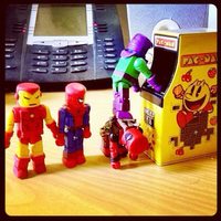
We all just going to pretend like this didn’t happen? https://www.instagram.com/p/C92_ch7J4n_/?igsh=MWkyM2ZxcTdid2UweA==
-
10 hours ago, buttheadsmate said:
WG Star Brand's shoulder pieces on a Thor might just do the job that I'm suggesting .
Can’t we just add the flesh colored Bisceps from a blob to one? I did that with Hyperion and called it a day years ago.
-
Do we know when this set will be announced? Will it be at SDCC or in NYCC?
-
The only Thor looks I can think of that aren’t done are the Crossing Thor and the Herald Thor. To me, the Thor is just there. I just want the Wrecker, Bulldozer, Piledriver and Thunderball. Sell them with My Little Pony Thor for all I care.
-
2 hours ago, TheMinimateKing30 said:
Honestly, I went back to re-read this thread, and when I saw your opening message again, I instantly thought about what Diamond could do for a new Thor-centered box set. IDK why. XD
I think it’s because we have been banging on for Thor V The Wrecking Crew for a few years now.
-
I wish we had gotten the first 13 but grateful we got what we got. I have to say though if you aren’t reading the Energon Universe you are missing out!
-
I’ll forever be bummed we didn’t get villains but hey worse things have happened.
-
On 7/7/2024 at 4:55 AM, buttheadsmate said:
I still can't believe that we still just have the one box set !
Would be great if they did a reissue now that people know who the characters are.
-
On 6/20/2024 at 5:19 PM, buttheadsmate said:
The DVD set was released between the releases of box sets 1 & 2 . I personally found that odd .
Pure conjecture on my part , if sales of the second release ....the DVD set ...were sluggish then (perhaps) a decision was made (at the top) to decrease the production on 'Box set 2' ? I'm pointing that out because Box set 2 is (as far as I can see) completely unobtainable anywhere whilst the 'DVD' & 'Box set 1' are still plentiful.
I just assumed people bought multiples because of the extra heads. 🤷
-
5 hours ago, buttheadsmate said:
You're right &, I agree, it's best to just say that it needs...er..an update. I always felt that that Minimate & it's packman 'Colossus' had their belts way too high on their bodies , always looked weird to me.
I personally have had heart for a slipper foot Logan. Yes, everyone in Minimated land is 2inches for the most part but the heart wants what it wants.
-
15 hours ago, BuffaloDelorean said:
It would be pretty funny if the success of the comics led to a new set of Duke, Scarlett, Cobra Commander, and Destro.
I'd still like Road Pig and Thrasher, but at this point the odds of a proper Road Warrior set seem considerably higher.
I’m loving the new series and books. The looks are different but I don’t think they are different enough that I would overlook my 4th Scarlett, 3rd Coco, 2nd Destro/Duke. But we could mix and match and do a Duke, Hawk, Flint and Lady Jaye and I’d stomach the repeats…
-
2 minutes ago, Trekker 42 said:
Plus making 3 each of Storm Shadow, Scarlett, and Snake Eyes in the first four releases of the line. I get they’re popular but it’s a bit excessive to do that many of the same character.
I’ll be slightly sad when the footlockers go but only because I like the cut out files.We can dig into this till the cows come home. DST doesn’t want to hear it. At the end of the day 16 figures were released across 4 sets and 11 figures were the same figure. They don’t want to hear it.
-
I will be buying the hell out of this set. I don’t care what it is.
-
On 5/29/2024 at 6:35 PM, Chooch said:
That would be awesome. There are enough vehicles to do a set for every 1-2 characters. Great designs all around.
As someone who didn’t get the cats lair or tank i support lego doing this.
-
On 5/28/2024 at 1:54 PM, murderofcrows said:
ugh just one more box set, with minimal packaging, just do a VHS box like transformers. All new 4 2 joe 2 cobra... come on zach. make it happen
This is what should have been done to begin with. I just hope the ambition of the footlockers didn’t kill the line.
-
4 hours ago, Trekker 42 said:
You bought them all?
It would be like me too, but no I don’t know what happened next.
-
Had a dream we convinced an online retailer to do a 4 pack army builder. 3000 sets made. It was beautiful.
-
1 hour ago, Trekker 42 said:
Just finished Transformers and I’m in for this. I’ll be getting the trades for the rest of these as soon as they’re released.
What exactly is Void Rivals? Does Kirkman still have his TWD age Magic Touch?
Don’t want to spoil it but there’s a reason it was the first book in the new era. Go get it!
-
7 hours ago, nandoninny said:
so, like most of us i was sad as hell to hear sales weren't good and that most likely this line isn't moving forward and i wouldn't get my tiger force set or firefly or even flint. i'm still holding hope though that like the cancelled ninja turtles that these could make a comeback.
here's how:
the new GI JOE comics are some of the best selling comics at the moment. outselling batman from what one article stated. do a set (or various) based on the new comics. get some hype going. then announce a 'retro' line.
https://bleedingcool.com/comics/scarlett-1-sets-gi-joe-sales-record-with-over-80000-orders/
the designs of the new books are classic enough for those who want figures of the old stuff to be satisfied but if tied to the new books could gain much needed traction.
and then hopefully some army builders and maybe even a Wreckage figure.
Seriously the Engeron Universe being created is outstanding.
-
On 5/20/2024 at 2:09 PM, Padrino said:
I also QC'ed some of the silverhawks and am working on a space ghost right now. I am more than happy for any and all 70's/80's/90's cartoons to get some representation!
Pics or it didn’t happen.
-
On 5/15/2024 at 1:39 PM, Padrino said:
I am happy to second this! I have the I-Men sets but they are nowhere near the same quality as minimates
SAME! A Hanna B license spree would be incredible. Herculoids, Johnny Quest, Space Ghost and more!
I also think the Silver Hawks, Jem, MASK, and Visionaries would kill it.
-
I have been screaming this for 20 years -> Buffy.
Marvel Wave 87: X-Men
in Marvel Minimates
Posted
Party